Week 3 - First interviews
We’re exploring the question: How might tech support communities to carry out collective decision-making and collective design?
We write weeknotes as an open and transparent way of documenting our thoughts, feelings, ideas and progress. Please read them so you can set us straight on any misunderstandings or pitfalls before we’re knee-deep in the project :)
Short version:
- Interviewed Khadra (formerly Camden Giving), a Neighbourhood Planning facilitator and Samuel (The Other Foundation) 🗣️
- Learned about another tool for consultation: Your Priorities ✔️
- Took part in a collaborative design workshop with Foodhall, a community kitchen and public dining space! 🥗
- Published our weeknotes online 📡
Next week… more user-research and journey-mapping 🗺️
We interviewed Khadra, Samuel and a neighbourhood plan facilitator
We’ve started user-research! 🎉
Khadra, formerly Camden Giving
Last Friday we spoke to Khadra (formerly of Camden Giving) about her experience of facilitating Participatory Grant Making (PGM) funding there.
This interview was rich. We’ve not gone through it for insights just yet, but it’s started to help us add colour to the journey maps we’re making for PGM.
Reminder: we’re mapping 1) the journey of a “panelist” - someone with lived experience, invited to help design the fund and select what applications get funded and 2) the journey of someone applying to a fund. Work in progress here 🚧
Samuel, The Other Foundation
On Wednesday we spoke to Samuel from The Other Foundation. The Other Foundation have been using participatory grantmaking approaches since their inception in 2014; they fund both organisations and individuals working to improve the lives of LGBTI (Lesbian, Gay, Bisexual, Trans and Intersex) people across 13 countries in Southern Africa. They’ve been doing this since 2014, so are really experienced.
These two interviews have really helped us get into the nitty-gritty of how PGM works on the ground. I’m finding it hard not to jump into ideas after each interview and need to remind myself to slow down!
Neighbourhood Planning Facilitation
We also spoke to someone with lots of experience in developing neighbourhood plans with different communities in the North. Neighbourhood planning gives communities direct power to develop a shared vision for their neighbourhood and shape the development and growth of their local area (for more, see What is neighbourhood planning?) A different sort of collective-design…
I always find this part of the research process knotty and my head gets fuggy. Lots of interwoven stories and experiences, but it’s great getting into the realities of collective-design making. It’s also lovely how everyone’s being so generous with their time and knowledge and interested to see where this work goes. We’ll definitely have some users to test our prototype with here!
Learned about the software: Your Priorities
In our interview about Neighbourhood Facilitation we learned that they’ve been asked to run another public consultation. This will have to be online and, having reviewed a number of tools, they’ve selected Your Priorities made by Icelandic Citizens Foundation.
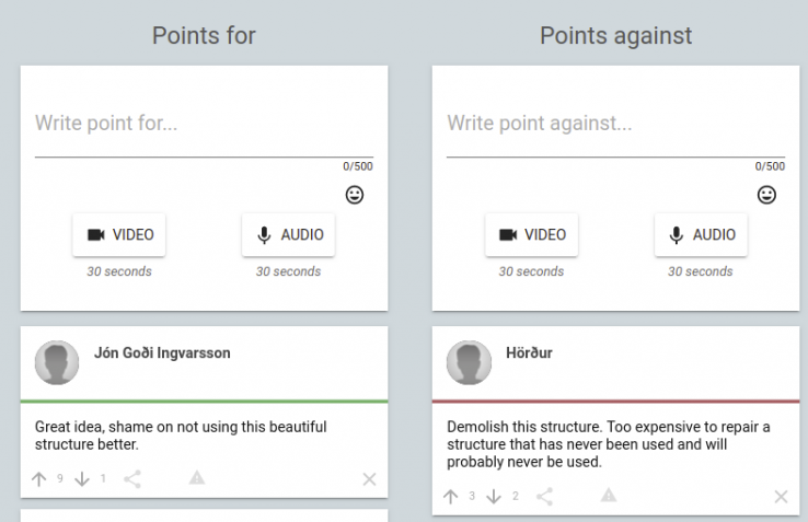
The software allows you to create an engagement community then invite people to submit ideas. Other people can then add points for or points against those ideas:

Discouraging trolling & personal arguments
From a product training video:
Other people can vote the point up or down, but they can’t comment directly on it. They’ll have to write a standalone counter-point that has no direct connection to your initial point. This makes trolling almost impossible and personal arguments very hard. And is the key to the high quality engagement that is achieved when using Your Priorities platform.
That’s a design pattern we’ve heard before from Audrey Tang in the vTaiwan project.
It’s an encouraging pattern which demonstrates that mass participation doesn’t necessarily invite trolling or require a huge amount of moderation.
Voting options
Also interesting: the software supports different types of voting for different contexts:
- 👍🏽 👎🏽 thumbs up / thumbs down
- ⬆️ ⬇️ up arrow / down arrow
- ❤️ 🛑 heart / stop sign
- something totally custom
Intriguing! I didn’t find any guidance on when I’d want to pick each type - I get the feeling there’s a lot of experience behind the scenes. Without that experience the software’s backend feels a little overwhelming. There’s a lot of customising you can do!
We had a look at some live projects and saw that it’s certainly being used. While some projects look a bit experimental and unloved, others like Frome’s Community Budget have a fair amount of voting and points for and against.
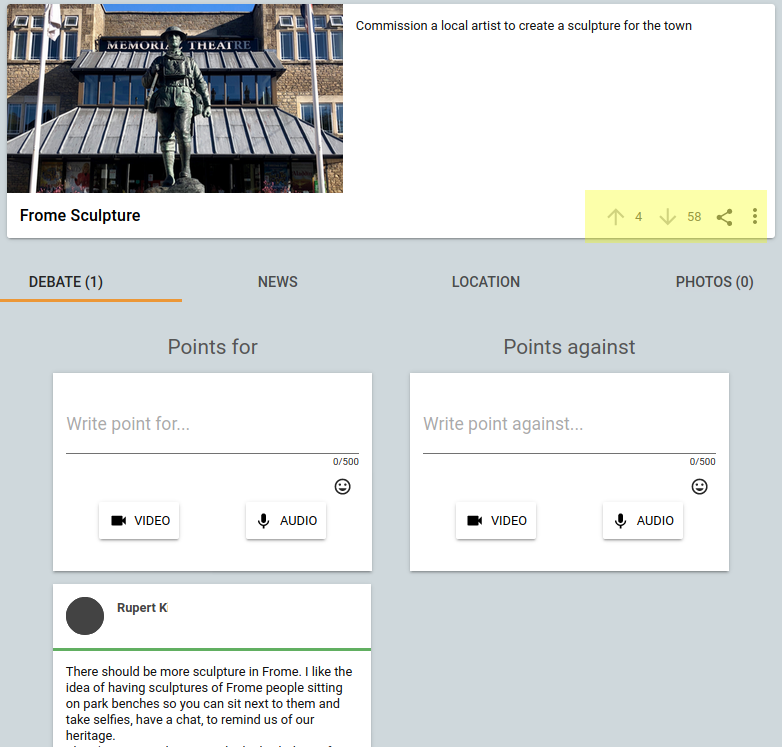
Here’s one that tickled me: a proposal to “Commission a local artist to create a sculpture for the town”. Sounds like the kind of idea that might come from a local council… but what do residents think?

4 upvotes versus 58 downvotes - a clear no, despite only a single written point.
It seems that having both points for and against, and voting is powerful. I was interested that no-one wrote points against, despite the strong negative feeling. Perhaps people don’t want to upset the proposer?
It’s mature, well-used software
This is a serious project: Citizens Foundation have been using the software to run the Better Reykjavík project since 2010. They say they’ve achieved participation from 70,000 citizens out of a population of 120,000, with over 10K ideas and 21K for and against points.
They also have an impressive list of case studies from deployments around the world.
Ian took part in a collaborative design workshop with Foodhall
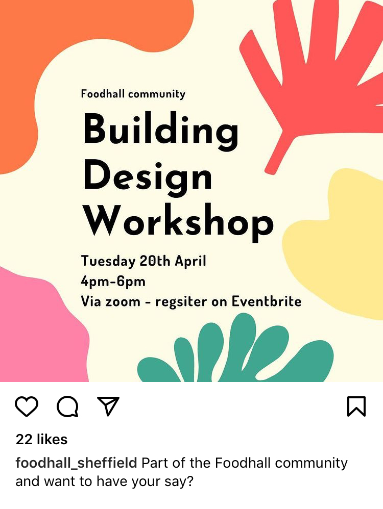
Last week I saw a timely post in my Instagram feed from Foodhall. They’re a community kitchen and public dining room based in Sheffield:

I thought this would be a great chance to experience some collective design and decision-making for real!
By way of background, Foodhall is a community pay-as-you-feel cafe and a whole lot more. They’re a pottery studio, host bike-maintenance workshops, art exhibitions and provide a place for people to meet and hang out. During covid they’ve been delivering hundreds of hot and cold food parcels to vulnerable people in self isolation.
They’ve recently secured a new physical space and are in the process of collectively imagining how they’ll use that space. This workshop was an opportunity to get involved with just that.
I’ll use these weeknotes as an opportunity to document what happened.
Prior to the meeting, we’d been sent a bunch of feedback from people who use the space. They were all formatted as ‘user stories’, so for example:
“As a… person who is unhoused, I want… a Shower and Laundry room, so that… I can maintain personal hygiene.”
or
“As a… person with children, I want… a child friendly space (e.g. a space with toys), so that… those children have somewhere fun to go when parents visit Foodhall.”
This was a great framework as it helped you understand _why _people were after different uses of the space - it also really opened my eyes to the ways Foodhall is used, not all of which I’d experienced.
Then during the meeting, it was our task collectively to discuss these different needs and decide how to arrange the space to accommodate them. The workshop took place on Zoom and used Miro. About 9 of us turned up.
At the start of the workshop on one the volunteers at Foodhall played a video they’d made doing a tour of the space. I thought this was great as it helped ground me in thinking about the space and it was really engaging.
While most people hadn’t used Miro before, we quickly got to grips with it, but it remains one of those things that just doesn’t feel natural.
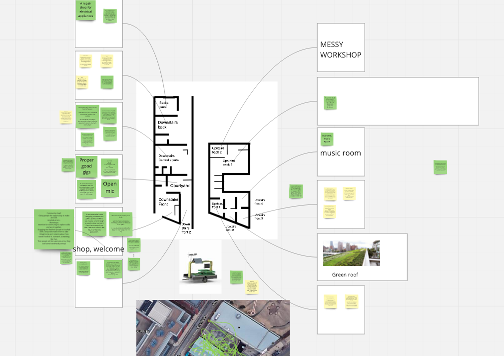
We split into two groups on Zoom for the majority of the session where we discussed the needs and started arranging them on a plan of the space:

It struck me how Miro allowed us to start copying-and-pasting images from elsewhere on the web in a way that a traditional workshop with whiteboard wouldn’t allow. This brought the user needs and ideas to life.
However, in many ways the process felt pretty similar to how I expected we’d have approached it had we all been together in the same room: walls with maps and post-its, breakout tables, then come together to playback what we discussed or decided.
We reached a broad consensus on how we felt the space could be used and I have certainly come away feeling more invested in the project.
It’s useful when it’s clear where you are in the process of collective design or decision making.
I wasn’t entirely sure what was going to happen with our design until the end of the workshop. I think laying out the process upfront and making it super clear where you are, and what the consequences are of the work is helpful. It made me think of OpenIDEO’s design challenge pages and how they clearly signpost where you are at a moment in a process:

We published our weeknotes online
We enjoy working in the open and it was always our plan to publish our weeknotes online. I think it’ll be an important artifact of the project, serving as the detailed write-up to accompany the journey maps and prototypes.
To unblock this, we needed a project name that’s not “PGM Digital”. We did the trusty post-it note naming exercise the GV sprint book and came up with the name “Collective Tech”.
So this week, rather than being locked away in 5 people’s inboxes, this weeknote will proudly live at its new home, collectivetech.io
Thanks for reading,
Ian & Paul
