Chapter 1: Applying for money
Chapter 1 of the prototype is about applying for money.
All grant-making organisations have a process where someone who needs funding applies to get it.
Grant-makers want good applications from a wide and diverse group of people. They worry that the same people always apply and get the money. Those people that understand the jargon, or know what to write. The fact that professional grant-writers exist is a hint that something’s not right.
I think it’s a major issue in the funding sector … because we’ve developed all this language and ways of working that’s just not accessible whatsoever.
We believe there are many people in the community with strong ideas who don’t apply for funding. Some lack the confidence or skills to write a traditional grant application. Others have ideas that are simply too pioneering to fit into traditional frames of reference.
To attract these people and achieve real diversity in applications, it’s critical to get the first stage right.
Hearing about a fund
How do people find out that money is available in the first place?
Reaching a wide and diverse group of people takes effort and tactics. It’s not enough to assume people look at your website or follow your socials. (Even if they did, will Facebook’s algorithm select your post to show to others?)
You can use tech to maximise the potential that people in the community** will tell each other** about the fund.
When promoting the fund in your network, make it easy for them to share with their communities.
Recommendations
- Funds should have a landing page specifically for people thinking about applying. It should have its own URL that can be shared easily in an email, on social, via WhatsApp and so on.
- The landing page should be glanceable when shared by having a clear title, meta description and open graph tags.
- It should be designed primarily for mobile, where most browsing and sharing is done. (Don’t use Word documents or PDFs.)
- It should communicate the funding criteria and how decisions are made.
- It should show past applications - in full - as well as feedback. Using examples is a powerful way of showing that something isn’t difficult.
- It should communicate how the process works with timelines.
Prototype
Aamna volunteers at the local asylum centre. She has a few ideas for day trips she’d like to run but they would cost money..
She has never considered applying for any funding before because she feels it would be too difficult. In the past she has seen long complicated application forms and a “funding workshop” at the library, making her think it must be something quite difficult.
She gets a message on her phone from a friend telling her about Saxford Giving, a micro-granting organisation.
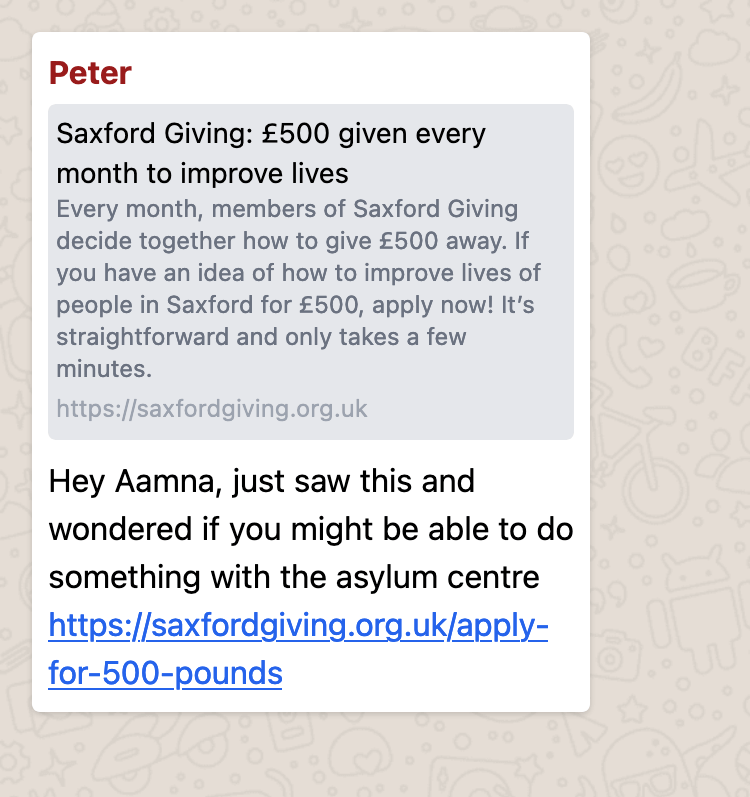
Aamna can see from the preview that it might be relevant.
She opens the link and finds it understandable - none of the jargon she expected to see.
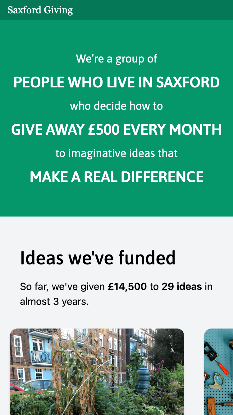
She scrolls past the images of past projects and starts to understand what type of ideas Saxford Giving funds.
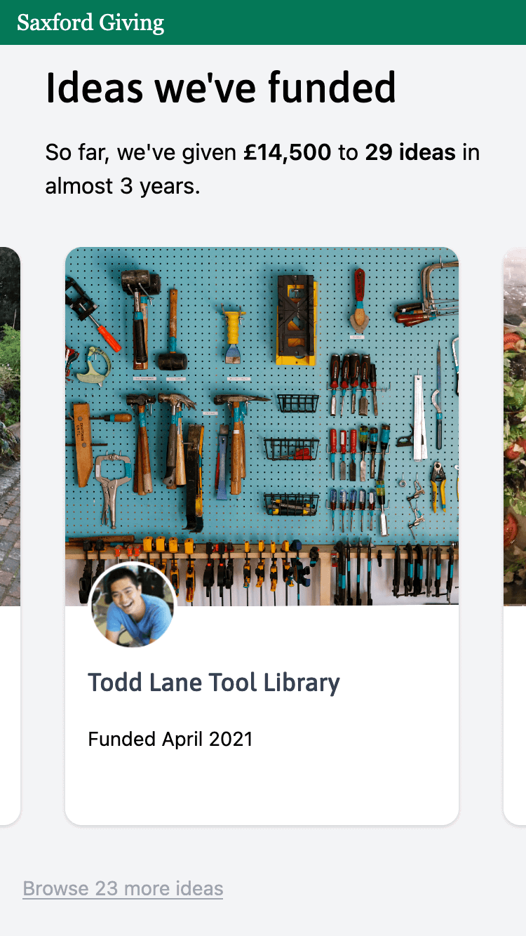
She sees lots of faces and thinks they look like fairly ordinary people. She starts to understand that the money given is based on the decisions of regular people in Saxford.
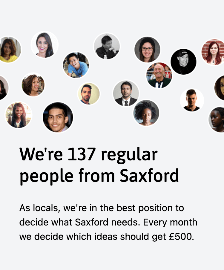
She’s confused by ‘automated admin’ and isn’t sure what it means.
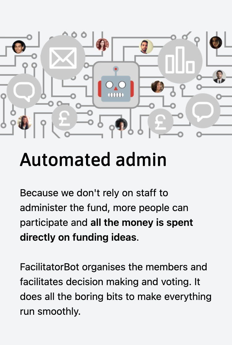
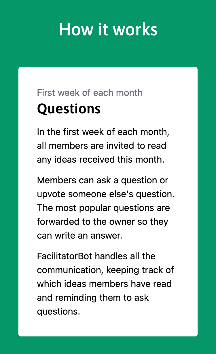
She reads more about how it works and starts to understand that members make decisions and that FacilitatorBot just helps organise the members.
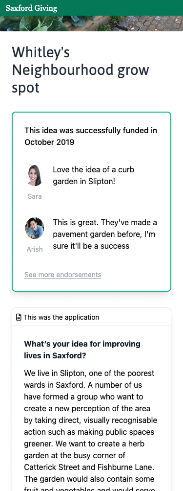
She goes back to one of the past ideas that’s been funded before.
She feels reassured that the application wasn’t full of fancy words and seemed pretty straightforward. She can see the whole application and it’s only two questions.
She starts to feel like she could probably apply for this.
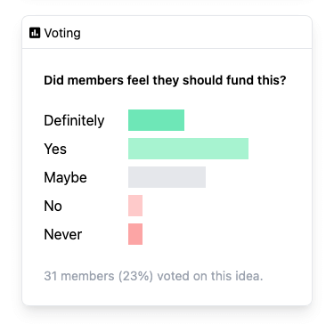
She sees the voting results and remembers that the decision was made by a big group of people voting.
She feels reassured that a group of local people would understand her idea for the asylum centre.
The application form
With luck and effort, a wide group of people will see your landing page, understand what the fund is all about and how it works, and share it with others.
Next, people have to actually apply.
From the insights, everyone highlighted the importance of simplifying applications.
There’s 300, 500 words. In my opinion that’s at least as much information as you need. The proposal isn’t complicated, what it is you want to do, why you want to do it, who you are, how much it’s going to cost roughly and that’s about it.
We also know that people don’t apply on their own - they ask others for help or work on an application with group members or colleagues.
Recommendations
- Design for mobile. Don’t use Word documents or PDFs.
- Ask a small number of simple questions. Make it as easy as possible to convey the main features of the idea and support follow-up questions later on.
- Provide short guidance notes inline, right next to the place that the application is filled out. Avoid separate guidance documents as it’s awkward to switch between two things on a mobile.
- Support sharing with a friend to make suggestions and edits. Completing an application is usually a collaborative task, so treat it that way.
- Assume that the applicant will complete the application over** several sessions** rather than all in one go. Treat it as an in-progress draft, rather than something that’s written once and submitted as final.
- Ask for a rough budget rather than a precise one. Reviewers can get fixated on the details of a budget rather than the overall concept.
- Eliminate or defer due diligence documentation. Let the community of reviewers look for warning signs, especially for micro-grants. If due diligence is required, ask for documentation after an idea has won the members’ vote. Many applicants will be unsuccessful each round: don’t waste their time providing documents that are never read.
- Don’t require login to start doing the application - handle that later.
- Keep the application open all the time and be upfront about timelines. Don’t make applicants fit in with the fund’s schedule as many will go away and not come back. Make it easy to see what’s required and to apply, no matter when they arrive.
Prototype
Aamna clicks “Apply for £500” just to see what she’d need to do.
It looks simple, so she starts typing an idea into the box.
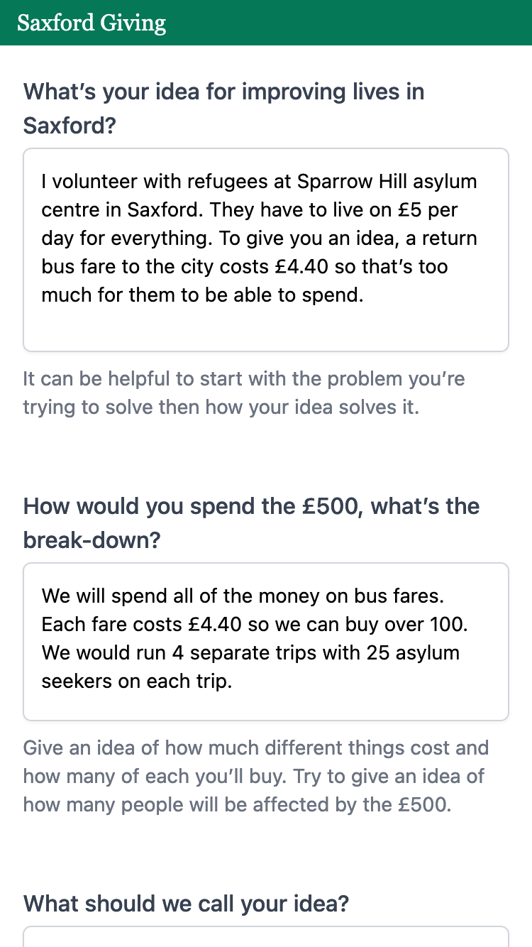
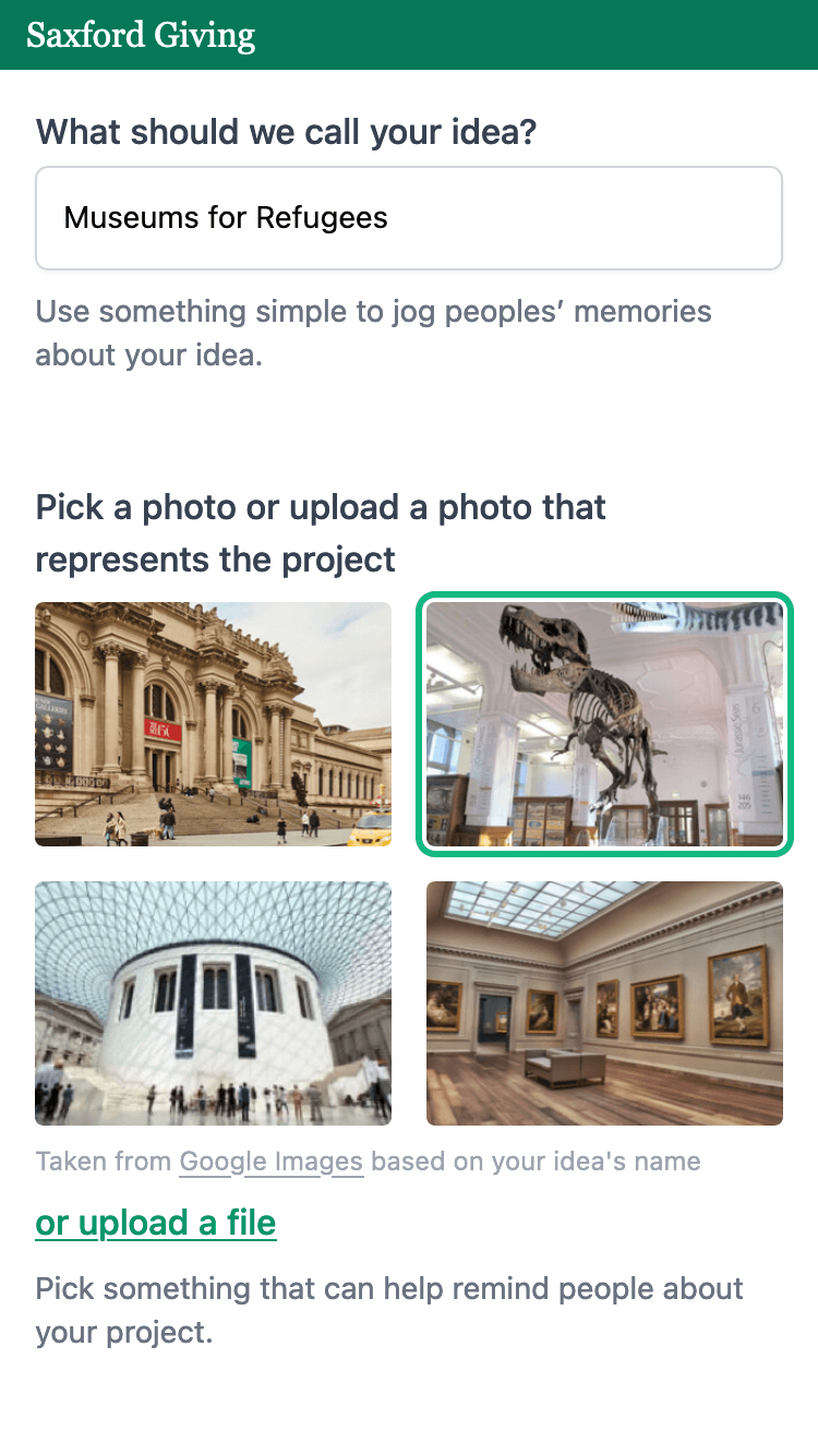
She picks a photo of a T. Rex from the automatic suggestions. It makes her idea look more appealing.
She sees that she can share the application for help.
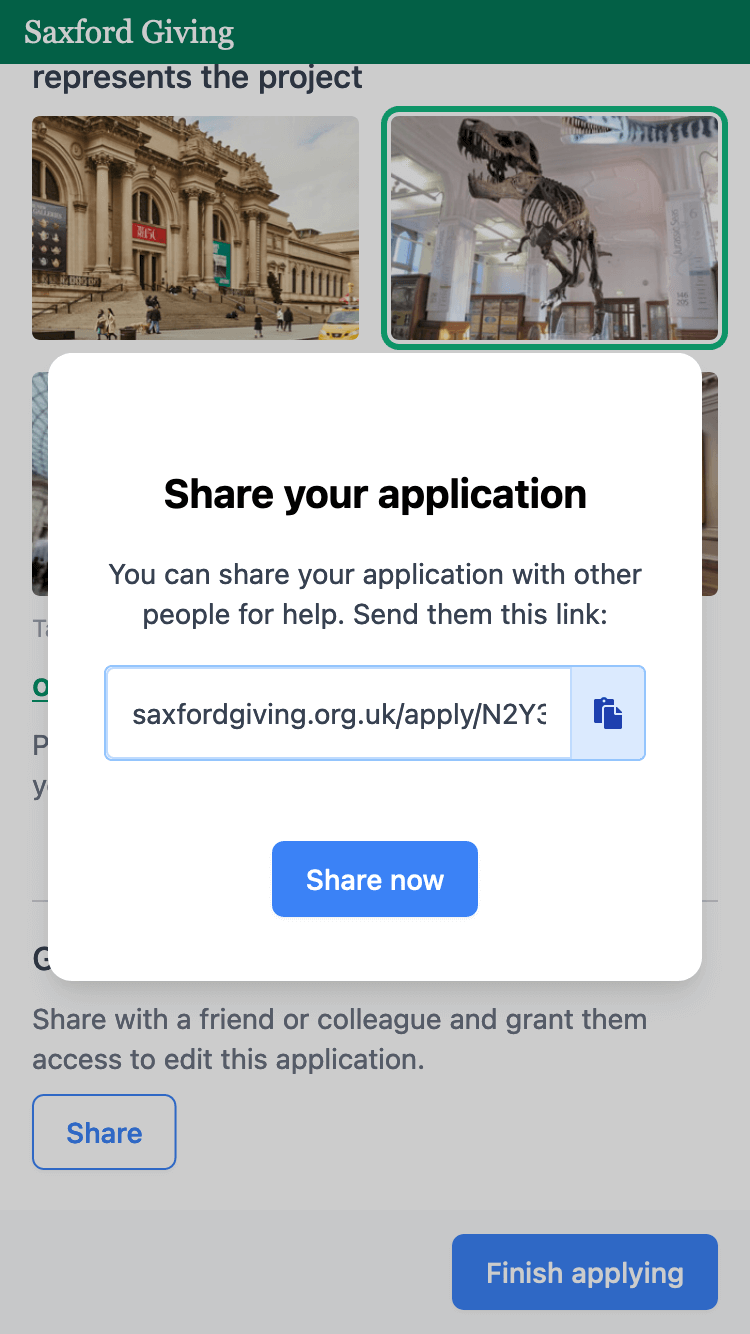
Her friend Claire springs to mind and she sends her a message.
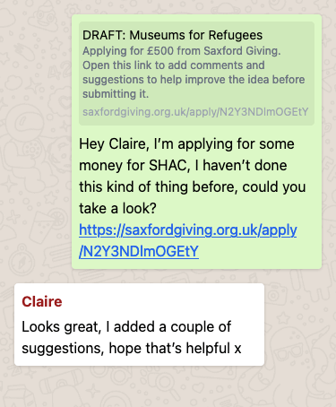
After a few hours, Claire has made some suggested edits. Aamna re-opens the application and takes a look. She can see what’s been added and a comment from Claire at the bottom.
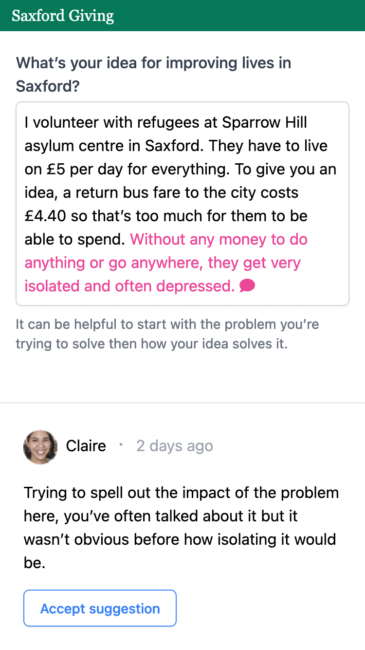
Aamna comes back to the application a few times over the next few days, then submits the application.
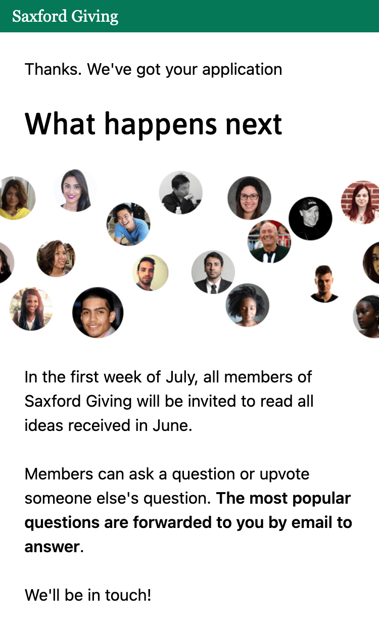
She sees a screen reiterating what she read before about how the process works. She feels confident that she knows what to expect.
