Chapter 2: Reviewing
Chapter 2 is about reviewing applications.
In this stage, reviewers read applications, make notes and possibly ask clarifying questions.
Given a group of reviewers, how do we make it simple and convenient for them to read and ask questions on a large number of applications?
How do we engage a large number of reviewers without a huge admin burden?
How do we ensure reviewers actually read applications?
How do we encourage constructive questions, while deterring trolling and personal comments?
Tech can support scale
Some participatory grant-makers use a panel of reviewers and do in-person decision making. This necessarily limits the possible number of reviewers - we heard about panels of around 15-50 people.
In-person decision making has additional purposes such as community building, upskilling, solidarity and more. We aren’t advocating replacing them.
But in-person events do exclude people who aren’t able to commit to a particular time and place. And they exclude a segment of people who’d like to have some participation, but not necessarily an in-person event.
We think there’s a big opportunity for increasing participation by using digital tools.
If applications could be reviewed online at any time, could 10 or 100 times more people review applications and give their input?
Or how about a hybrid system, where 20,000 people participate digitally in a “lightweight” way and 20 people participate in-person, using the questions, comments and votes from the larger group. This would gather wider participation while retaining the benefits of an in-person event.
FundAction have put this into practise: for their two smaller funds, applications, deliberation and decision making are carried out entirely online.
The Iceland-based Your Priorities software is used for mass consultation all over the world.
Problems with reviewing lots of applications
We heard about panelists being sent a pack of applications to review. Typically reviewers were looking at around 50 applications.
It sounded cumbersome with ZIP files, Word documents and spreadsheets of supporting information. Reviewers were expected to review applications while sat at a computer, switching between different documents.
Perhaps unsurprisingly, we heard that reviewers would turn up to deliberation without having read all the applications.
Worse, applications were usually listed in the same order to all reviewers. If all reviewers read the same 70% of applications, that introduces a bias.
Recommendations
- Design primarily for mobile. Don’t send Word docs, PDFs or spreadsheets.
- Support reviewing in several short sessions. Keep track of progress, make it easy to jump back in.
- Present everything in one place. Don’t make reviewers switch between different documents
- Randomise the order of applications per-reviewer. Each reviewer should see a consistent order, but different from everyone else’s order.
- Support writing private notes or highlighting text on the application to jog the memory when voting later on.
- Embrace the idea that each person may not review 100% of applications. Having 10x or 100x more reviewers allows each application to get good review coverage without everyone reading everything.
- Use “upvote a question or ask a new one” pattern. Used successfully by vTaiwan and YourPriorities, by preventing direct replies to questions, it diffused trolling and personal attacks. The most upvoted questions become more prominent while poorly considered questions sink to the bottom.
- Make questions and answers public and visible to all. This provides transparency and efficiently provides extra information to all reviewers at the same time.
- Automate email reminders as deadlines approach. Don’t expect people to remember deadlines or regularly check a website. Use automation so it always happens, on time.
- Personalise emails to make it easy to jump back into the reviewing process.
- Expect 15-30% of a large group of reviewers to actually engage and vote (based on Edge Fund and FundAction.)
Prototype
Tina is a member of Saxford giving. She sees an email from FacilitatorBot telling her there are new ideas open for questions.
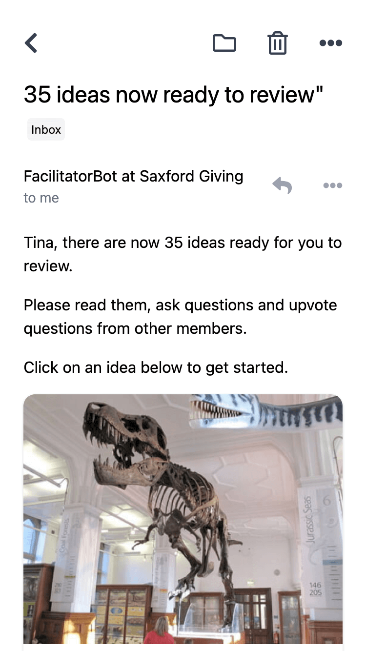
The images in the email are appealing and it’s easy to jump straight into the first idea.
She reads the idea and makes a few personal highlights to jog her memory later.
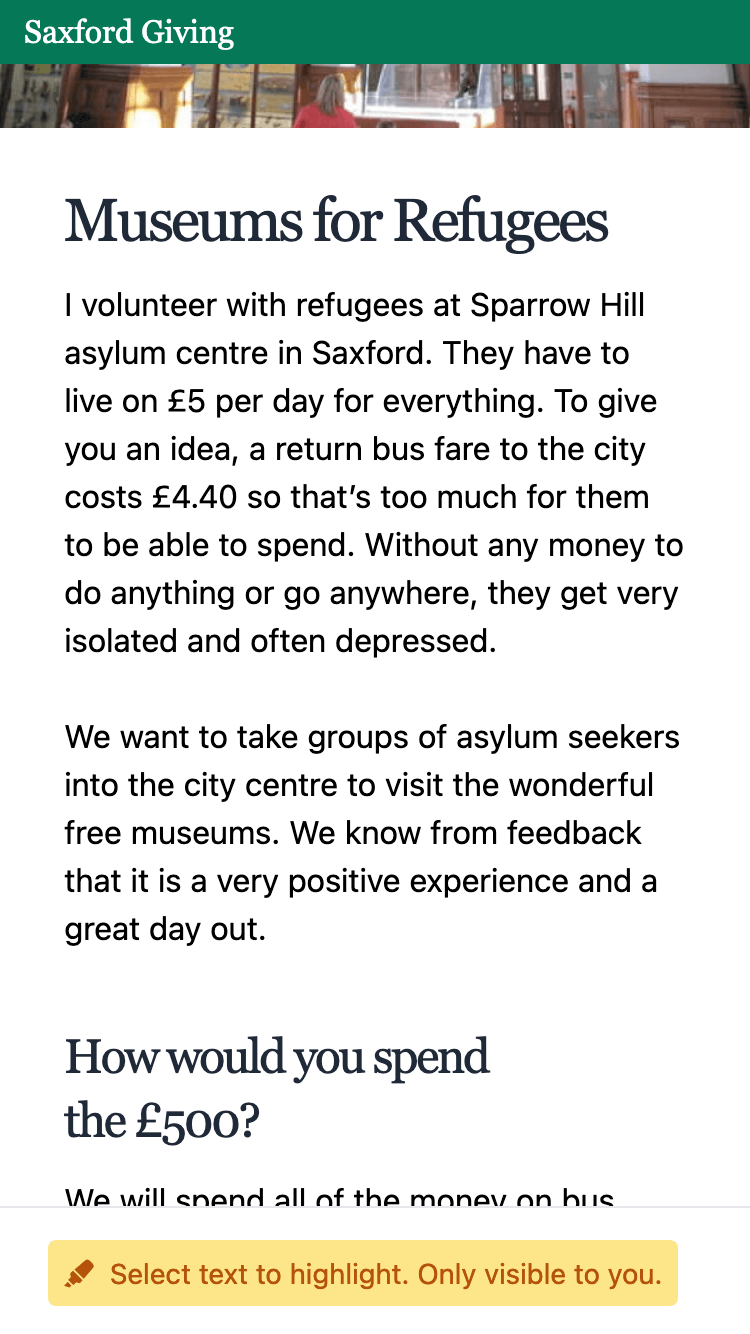
She sees questions that other members have asked.
The faded-out questions need more upvotes before Aamna is notified.
This acts as a filter for questions which are unpopular like the one shown below. The question is still visible, but won’t need answering unless it gets more upvotes. This is a type of informal community moderation.
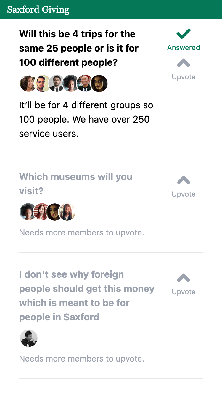
Tina asks another question then jumps straight to the next idea. She doesn’t have to go back to a list of ideas, she just moves from one to the next.
After a while, she has to do something else, and closes the tab.
Three days later, Tina gets another email reminding her to read and ask questions for the remaining ideas.
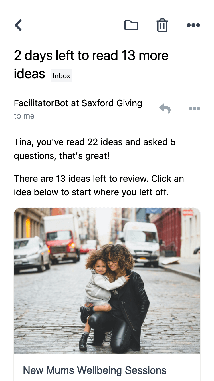
She doesn’t need to remember where she got to as FacilitatorBot has kept track of which ideas she has read.
She sees the deadline approaching and is motivated to finish looking at the remaining 13 ideas.
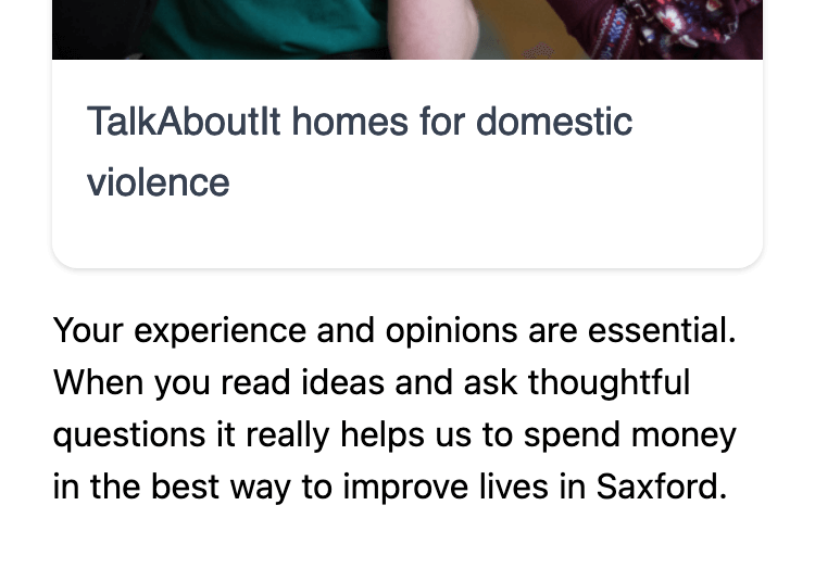
She reads the text at the bottom of the email and is motivated by the idea of helping Saxford Giving.
Meanwhile, several members have upvoted one of the questions on Aamna’s idea, Museums for Refugees.
Aamna receives an email from FacilitatorBot prompting her to answer the question.

She didn’t have to remember to check a website.
